
A font says a lot about a person or a company. For example, if you’re using Papyrus you are very obviously longing for a different time, hoping to inspire change through an organic return to nature and the way things were. Ralph Waldo Emerson probably would have enjoyed papyrus unlike Ryan Gosling…

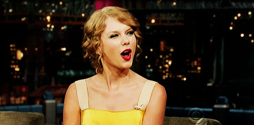
If you use Times New Roman you’re traditional, lasting, and you know your brand knows what it’s talking about. Taylor Swift has used Times New Roman in her record branding… enough said.
If you’re a super cool, down-to-earth civic tech start up your font is probably Gotham (our font is Gotham).
Our font isn’t Gotham just because it portrays an aura of cool with a splash of “smart kids on the block.” The Gotham font is also a font that has strong contrast that optimizes readability, accessibility, and usability.
-1.png)
The origins of the Gotham font stem from a designer inspired by the blocky, strong architectural lettering that dominated the streetscape in New York City from the 1930s to the 1960s. The font is uniquely American and since its origin in 2000, has gone on to be a part of Barack Obama’s 2008 Campaign, the One World Trade Center, Georgia’s Governor’s Office, and more.
Gotham is a sturdy font described by its creator, Tobias Frere-Jones, as “not the kind of letter a type designer would make. It’s the kind of letter an engineer would make.”
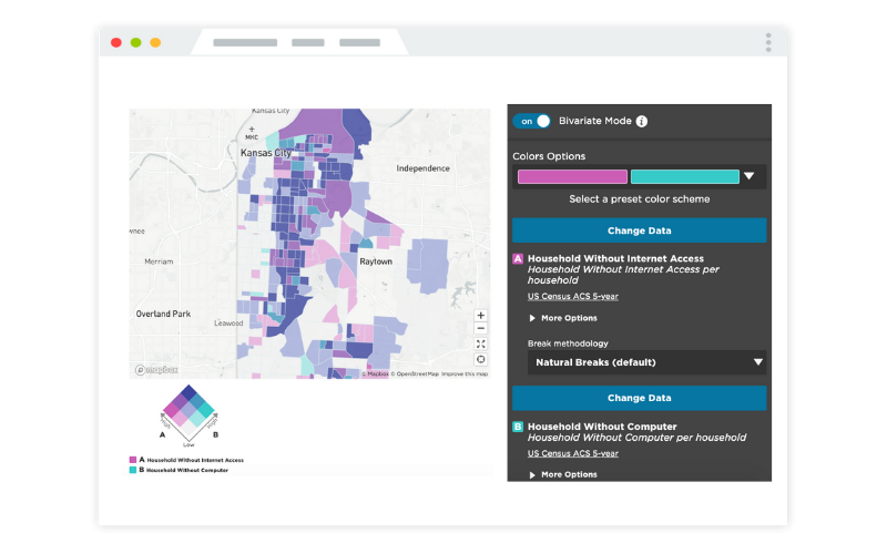
If you look at a dashboard and you never notice the font style, we can say we did our fonts right. When you look at a dashboard, our goal is that you see the story of your community and the data, not the way it’s formatted, the font, or the page hierarchy. Those things should work so well you don’t even think about them.
Fonts should integrate into the page seamlessly. A font is a vessel for the knowledge you’re trying to convey and if you want people to spend time looking at and reading your content, you better have a good font.
An MIT study found that good typography leads to longer engagement on a page meaning a good font encourages more readership and engagement. A good font might not be the end-all be-all for your dashboard, but it does support your content and it encourages readers to stay longer.
A good font is a font that supports content and makes your ideas shine, but doesn’t distract your audience.
So why did we choose Gotham?
One of the most important reasons is that Gotham is a sans serif font, not a serif. A serif is a little decorative line or foot that is found on serif font letters. Sans serif fonts are more basic and free of any frills or--technically--free of any serifs.
The first reason we use sans serifs is because of their utility in web design. The type of Gotham font we use is specifically tailored for use online. Typically sans serif fonts are used in web design because they are simple, straightforward, and strong.
They have clearly defined edges and make images and other parts of the page shine. Sans serifs also render on a computer screen better than serifs.
Computers can be confused by serifs and render their decorative edges as jagged and off-set. A sans serif is easier for a computer to render so it produces a more clear image in digital design, and the Gotham font was designed with the detail needed to be versatile and clean on every screen.
The second reason is that the Gotham sans serif font is a great font for data visualization and interacts with numbers well. The numbers in the font align in their different weights and they fit together well in charts. You can bold numbers and have them fit in the same framework as thin weights, creating a better visualization for numbers that need to be called out.
Gotham was designed with an attention to detail that was essential for data visualization.
In the dashboard building process we simplified font decision-making so you don’t have to and we made sure all your dashboards have the opportunity to be readable, simple, accessible, and well designed by using the Gotham font.
For more about font and design best practices sign up for our October 10th webinar with our designer JT and check out our dashboard dedicated to design best practices!
Share this

Evolving With Our Customers: The New CHA Solution

Democratizing Data for Public Service
No Comments Yet
Let us know what you think