
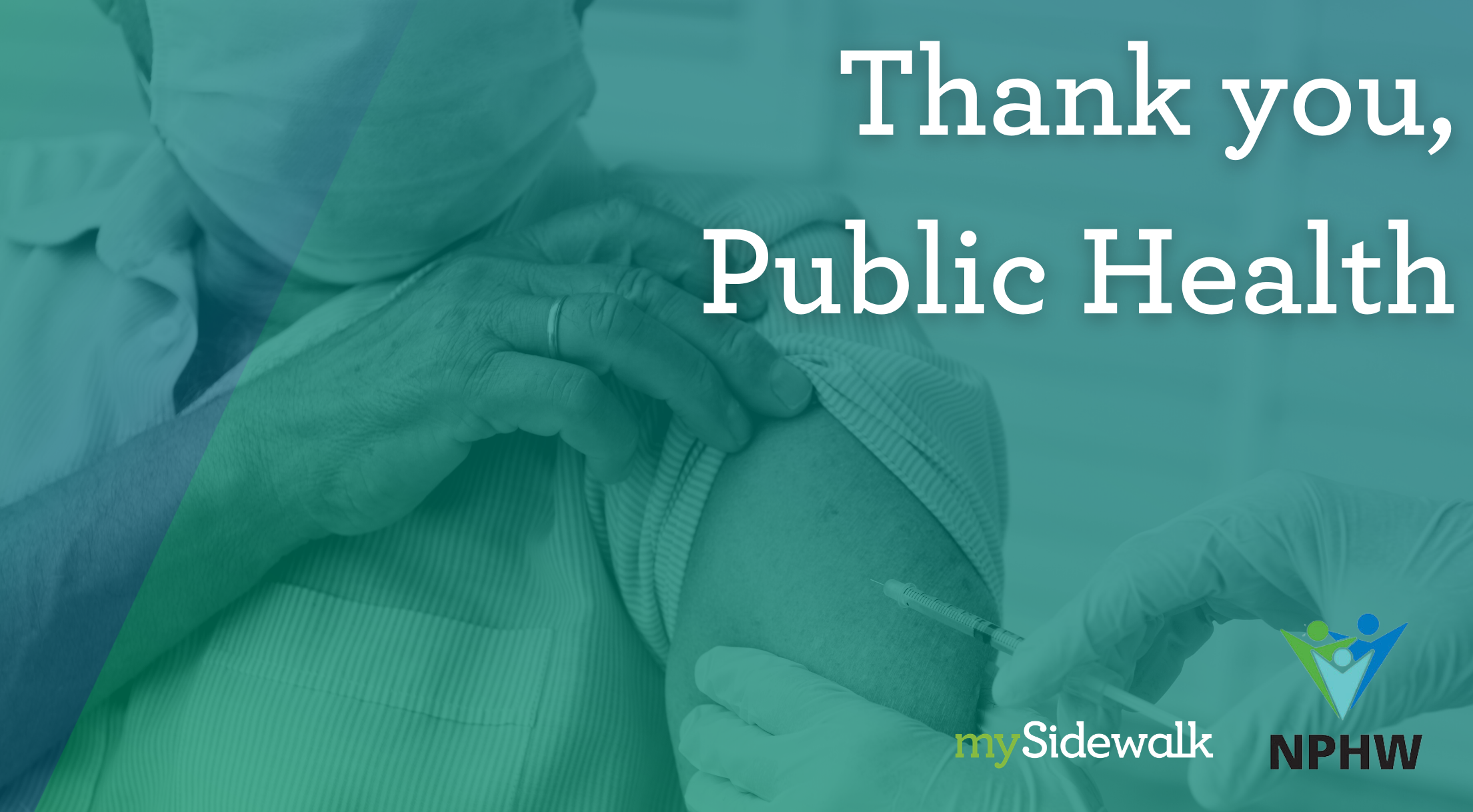
Vitalyst Spark: The Health Data Challenge, Part 1
Every day we come to work thinking about how data can make a better world. There are few “probletunities” as exciting and impactful as connecting health care, public health, and health outcomes through data. Listen in as Dr. Sarah Martin, VP of Health Solutions, and Stephen Hardy, CEO, chat about “The Health Data Challenge” on the Vitalyst Spark podcast.
Transcript
Stephen Hardy: If you ask a community member, would you rather have good care when you go to the hospital or would you rather never go? I think it's a pretty clear choice. And in order to be able to do that, you have to build communities where people are thriving. That's the key here is how do we build thriving communities? And what are the data points that we can look at the point, us in the right direction?
Sarah Martin: We democratize data by breaking down those barriers, because if you've ever been on a government website to get data, it's really difficult and probably on purpose. And so we're trying to really remove those barriers to entry for everyday people to get to the data.
Stephen Hardy: Data can change the world. And the world needs changing. And who wants to wait for perfect before we do that? We will never have all the data that part's true. I think we have the data that we need. The need will be a little bit different every time we rerun this, but we have the data we need to start making change.
John Ford: Hey everybody. Welcome back to the Vitalyst Spark podcast. I'm your host, John Ford. The conversation we're entering into today is both new, and one we've been having together for a long time on this podcast. It's a conversation about how to understand what makes community health more possible. And conversely, what makes it far less possible?
Henry David Thoreau—yes, the Walden guy—once wrote, "not that the story needs to be long, but it will take a long while to make it short." Thoreau, while sitting on the shore of a secluded pond in the 1800's, clearly had the story of 21st century health data in mind when he wrote this. Okay, maybe he didn't, but that quote fits the quest that Vitalyst has been on to share actionable, equitable data insights on community health so well that we're going to repeat it. Not that the story needs to be long, but it will take a long while to make it short.
Here we are in 2020 when it seems like everyone is an amateur epidemiologist thanks to COVID-19. Yet we all still struggle to find accessible, understandable data. We struggled when that data contradicts dominant narratives, and we struggled to reconcile what the numbers can tell us about how communities can live better and thrive.
Well, as the stoic philosophers like to say, "the obstacle may be daunting, but the obstacle is the way." So today we have two great guests who are involved in the health data struggle every day. Who lead a company that is helping Vitalyst and six of Arizona's county health departments work through data obstacles, so that we can all make better sense of the data and formulate actions and solutions for communities to thrive.
We'll get to our guests in a moment, but first, your weekly reminder, particularly as we move forward into another set of reopening steps. Don't stop being COVID smart. Stay at home as much as you possibly can. Wash up. Mask up. Maintain physical distancing, and keep a heads up for your fellow Arizonans. Yes, the numbers are much better. If we want continued lower numbers two to four weeks from now, our actions today make that difference.
All right, let's get to it. It's time to dig more deeply into the fascinating trials and tribulations of public health data, the rise of a series of local and statewide health dashboards that you can access to learn more about what is affecting community health. And how we can all build a more insightful, actionable, better understanding of health. Historically, presently and in the years to come
Today, we are talking about the intersection of data and health with two incredible friends of ours. First of all, the CEO of the platform, mySidewalk, Mr. Stephen Hardy. Stephen, how are you?
Stephen Hardy: I'm doing well, John. Thanks for having me.
John Ford: Thanks for being here. And Vice President of Health Solutions, Dr. Sarah Martin. Sarah, how are you?
Sarah Martin: I have never been better, John. Thank you. It's so good to be talking with you.
John Ford: All right. Let's dig in. Stephen, mySidewalk's been around for a long time and even had different products that had been about public engagement in the governing process. Talk about the journey that your organization has been on, and what got you to the point where you are today, where you're doing a whole bunch of health dashboards related to county health departments and cities and towns.
Stephen Hardy: It's a good question, John. When I think back about where we've been as a business, you know, we saw two fundamental gaps when it came to building better communities. One was, we just wanted people to be more involved. I mean, if we're going to succeed at community building, you have to have involvement and buy-in from everybody who lives there. And so the first tool we built, obviously it was MindMixer. It was meant to be a really good way to have a conversation online, but it was clear to us really quickly that we needed better tools for decision making, too. So. It's one thing to have a good, robust conversation. It's an entirely different thing to be basing that on the facts on the ground, and to be learning about what's working in other places around the country. And what's worked in the past. That's really been our fundamental mission here over the last five years, John is to be helping communities across the country use data to make better policy decisions, to build better communities and to help them thrive.
John Ford: Sarah, when we think of thriving communities like Stephen just mentioned. Often people think of health and then they default to healthcare. How should people be thinking about health more broadly?
Sarah Martin: When I started at mySidewalk, it was this idea that health was a vertical. It's one section of the company. Now the transformation in everyone's minds, internally, and also externally, is that health is everything. When I look at everything we do in the company—economic development, community development, public safety—we all started to change our minds. And now it's: "oh, health is everything." So you would talk to folks who are really into economic development in the company, and now they see themselves as a player in the health space. So this fuller understanding of wellness. I think now that it's been adopted by the healthcare sector, then everyone's on board! Whereas the public health sector had been talking about that for a long time, but a lot of that fell on deaf ears. Now that healthcare is involved, I think you're seeing the national narrative on health really blow up the difference between public health and healthcare, and now there's just a health sector versus one or the other.
Stephen Hardy: And you were asking Sarah about the difference between health and health care. And that's really the way I think about it. You know, on the healthcare side, if you ask a community member, "would you rather have good care when you go to the hospital or would you rather never go?" I think it's a pretty clear choice. And in order to be able to do that, you have to build communities where people are thriving. That's the key here, how do we build thriving communities? And what are the data points we can look at to point us in the right direction. So if 80% of your health is determined by factors that are larger than healthcare, how do we start wrapping our arms around that 80%? And in order to get a clear picture of that, you have to understand the underlying factors, and it's a complex system, and that's where data really matters. That's the only way to decipher what's going on with that other 80%.
John Ford: As you both know, Vitalyst came up with this elements of a healthy community wheel. This model, that many partners contributed to, that was built off of the World Health Organization's social determinants of health model. These models, they sound lovely until you get to the point where you have to put data behind them. Some of this is traditional data collection. Some of it's not. Some of it's really, really challenging. So talk about what you all have done as an organization to try and solve this problem of making data relevant to thriving and wellbeing and vibrancy.
Sarah Martin: One, the wheel we all have tattooed on our bodies. Because the wheel just became everything to us. When you came along, you were the first in the health space to really push us. A lot of people will use the lack of perfect data as a work avoidance mechanism, to not keep exploring. So it would be wonderful if we had an amazing assessment of structural racism for the entire state of Arizona. We didn't! And so what are we going to use instead? Okay. Let's start digging through. We've got 3,500 different indicators. There's gotta be something we can use. And we ended up landing on mortgage denial rates by race, controlling for income. What a fascinating proxy for some sort of embedded oppression or systematic "ism" inside a community.
Did it leave out a lot of parts of the state? Absolutely. We didn't have coverage in the data for everybody. Yeah. But it's something. And I think that that's one of the key differences about a mySidewalk experience versus just kind of a DIY, like, "here's data, plop it out there." Is that attention to narrative storytelling. But it takes a really special partner on the client side, who's ready to make that jump. If I went and asked someone, "would you rather have a bigger police force or better schools?" 9 out of 10 leaders, community members would be like, "We've got to invest in kids. We've got to invest in kids." But then even when we put the data out there, if we look at budget data, we see the inverse of priorities of people.
There's only so much we can do with just straight up data. It's necessary, but not sufficient. It's going to be that secret sauce, which is that attention to advocacy and policy that Stephen, so aptly described, that's going to make the difference. And that's the biggest challenge we have, whether it's healthcare, public health—any of our clients—that's really where the rubber meets the road, I guess, in a way.
John Ford: Here's the really compelling problem or probletunity maybe? Most people get it when you show them a map and you say, "Here's life expectancy by zip code and how can it be that the two zip codes right next to each other can have a 14 year difference in life expectancy? And they are blown away by that. And they start to understand that health is a function of place and that health is a function of things other than healthcare. But the harder part is when you dig past life expectancy to try to explain what those variations are and put data to it. How does mySidewalk approach that?
Stephen Hardy: You said it perfectly John, because that's it exactly. I mean, it is impossible to look at that life expectancy data and not be a little shook, and to not fundamentally see that we're failing as a meritocracy. That just isn't right. And the place part of it comes front and center as well. The gnarly problem here is completely a social determinants problem. We're dealing with community scale data and there are hundreds of connected variables. If health is in everything, then that means every data point points towards health, and we're still pulling apart, which are the ones that are more determinant? And a little less determinant? And what's the mixture that makes it whole? I think Sarah's point though is right on. Because this is a journey. To both of your points here: we're early on in this. But if you're thinking of data literacy, and really data-driven decision making, as not a, you don't do it and then you do do it, but instead an, okay, we're going to get a little bit better. And then we're going to get a little bit better. And then we're going to learn what we should be collecting. And we're going to collect it a little bit differently next time, because we wished we had this by race or by gender or whatever.
That's the only way that you move this forward. So it's a long iterative process. But it starts by getting your arms wrapped around it. And it is completely tied to actually looking at it on a map, John, and you said that really well. Because as soon as you do that, It becomes much more real. If you can imagine that place, if you've been to that place and you can imagine exactly where it looks like all of a sudden you have a fundamentally different understanding of what it's like to live there, and what that means to your community, and the change that needs to be invoked.
John Ford: Sarah, in roughly February-March, the curve ball got thrown to everybody, that was COVID-19. How does that story get told through data?
Sarah Martin: It's a mess, John, honestly. It's such a mess! I came up in public policy first and then I got into public health and I was deputy director and I was really involved nationally with our associations and never, ever, in all of my career, did I realize how fractured and dysfunctional our national public health infrastructure is. I was so focused on my own local health agency. We, I think received 37 cents per capita in federal funding that passed through the state. The average nationally was $14. And so we're working off scraps of a city budget. And I didn't realize there's no national database. You look at who has the best data right now. If I had to pick a source for data, it would be the New York Times. That is the world we live in, that the New York Times has better data on possible COVID cases, case fatality rates. I mean, it's like they have the best epidemiologists in the world at the New York Times. That's unacceptable, that we don't have a system by which information flows freely.
Even prior to COVID, if I had a case of E. coli, or something. I personally have had E. coli, but I'm saying if I was an epidemiologist and had an E. coli case, I report it to the state. When I go to run my summary statistics for the year, I don't get that data back for two years. So you talk about having to make data-driven decision-making as a mayor, governor, what have you, in the moment. There is no such thing as real time COVID data.
And so we're making decisions based on things that happen, two, three, four weeks ago, because you have an incubation period, too. So you got to think about all of this. So all that to say: I am so heartened by the successes we see among our customers, who are making the best just with what they have. But what they have is so little to go off of that we're not even sure how to make data-driven decisions, because we don't even know if the data is credible. Then you add on a political layer to it, where there is a mistrust of government, a mistrust that's sometimes stoked by government itself. And so any numbers that come out are going to be disputed and the Twitterverse instantly anyway. I have never seen a world where a health director has armed guards escorting them to their car at night, or epidemiologists are getting trolled on Twitter! They're just in the background, most of the time in the shadows. Nobody knew what my degree was in until February or March. That has turned the world upside down in a way. That sounds really fatalistic, and I am sorry to be so negative about it, but it's revealed much more than I ever expected about opportunities to strengthen our public health infrastructure in the future. And I'm hoping that we realize that and make those investments.
John Ford: Stephen, Sarah said something right there at the top where she said, she realized just how fractured the data collection situation is in public health. It seems that mySidewalk has that as part of its mission, to surface that amount of fracture, but also to heal that fracture and just start telling stories that cause people to ask more questions, and therefore, have more data investigation. Is that about right?
Stephen Hardy: It is. And, you know, the term "data silo" is almost as old as silos! And it's absolutely what we're trying to do, because as an example, Sarah and I live in Kansas City MSA. And that means two states, seven counties, a lot of different opinions. I don't even know how many school districts, and everybody's trying to make decisions on this stuff right now. And the siloed nature of that data is a fracture that we have to figure out how to overcome. That is fundamental to what we're trying to do, John. We talk a lot about democratizing data. The first thing you have to do is have good access to it, and that has to be fluid. And so that's absolutely something that has to be healed. Back to the COVID point though, and maybe some reasons to be optimistic, I do think that there's new attention here to where Sarah was leaving off, that this is going to get better. We've definitely seen what it looks like to be bad. And I do think it's going to get better. A couple of reasons for that. One, there's a fight happening nearby here in a school district, parents were up in front of the board arguing about whether or not schools should open. And it was the most sophisticated data argument I've heard out of a lay audience, probably ever! And so my point there is more that I actually think that the data literacy that we have as a country is being elevated pretty quickly. And the COVID actually is forcing our hand a little bit there. And I think that's a long term net positive. The data literacy that we have as a country, I think is headed in a good direction.
Two-and-a half years ago Sarah and I were having a drink when I was trying to twist her arm into joining mySidewalk, and the thing that she was saying was: at the end of the day policy is how we move the needle here. So how can we connect data to policy? And I actually think we've seen it happen in real time here as a COVID response. It's been more around the economic data, honestly, than in the health data.
I'm thinking about two good examples from customers of ours, where you had PPP dollars going to, and we can map where the PPP dollars are going, and simultaneously, we knew because we worked with the Kauffman Foundation, that there were more entrepreneurs in minority neighborhoods than there were in non-minority neighborhoods. And yet the PPP dollars were going to non-minority neighborhoods. So we could see that happening in real time! And we could work with them to immediately shift that and start targeting different neighborhoods with their microlending. And that's a real time data-driven policy response that I think is something that you couldn't imagine just five years ago.
In the CARES Act administration, we have another customer in the United Way, who's targeting their housing assistance based on where they know there's going to be the greatest need. And that's another place where we're able to use data to say, okay, who's most vulnerable? Let's look at past recessions, let's identify the people that are most vulnerable, and we can help you proactively reach out to people that are more likely to need housing assistance, because we've done that homework. We can get you ready for that before an incident even happens.
John Ford: So COVID is not the only thing that's happened in the last five-to-seven months, either. And you've alluded and walked around quite a bit, the issues of race and inequality by sort of using that term that we all do in public health, which is "vulnerable populations." Talk about two issues. One, who chooses what we measure, what we collect and how we interpret it. And what does that mean regarding race? And two, which data points do you find are most controversial, yet most revealing of the true root causes of inequity when it comes to health.
Sarah Martin: We tend to not use the term "vulnerable populations." And I know it's very popular amongst public health powers that be. We try to go one step above that, but the term vulnerability, I think deflects responsibility of the dominant groups. If we say "vulnerable," it kind of sounds a little wishy-washy, like someone is naturally vulnerable. Whereas we know that these inequities were created by people. And there was a certain generation where those things were embedded so that we tend to say things like "oppressed communities," "marginalized communities," "disinvestment" as action words associated with them. Does that fly everywhere? No. So to your point about controversy, we work in communities across the political spectrum. Right there in your own state we work in places that are very conservative in nature and very liberal in nature. So we have to always be riding the tide of our customer's expectations and not just being so dogmatic about things in our language and our data that we alienate, folks who really need to hear what the health organization, whether it's a department or a health care agency, has to say.
And so one of the data points, I think that is most telling, that we often use and we actually just plot system wide. When I say system wide, it means it's available to all customers, we democratize data by breaking down those barriers. Because if you've ever been on a government website to get data, it's really difficult and probably on purpose. So we're trying to really remove those barriers to entry for everyday people to get to the data. Infant and maternal mortality data is collected nationally and is available in our system now. And when you look at those by race and you can control for income—so if you filter for income, we're talking about affluent, highly-educated Black women who make all the "best" health decisions during pregnancy— who are still at six or seven times higher likelihood of dying in childbirth. Which should not happen in an industrialized country! There's a cognitive dissonance when it comes to birth that most people think in America, it should be safe and it should be very rare that a woman dies in childbirth. Or that a baby dies. So even when you control for that, three to four times more likely that that woman will lose her baby. That is really an intersection that is compelling to people across the political spectrum, across the divide of ideologies.
That is where storytelling comes into play as well because no baby deserves that. No mom deserves that—they're innocent. They're born innocent. That kind of takes away that stigma of, "Oh, well, those people don't make good choices. Those people aren't educated and that's their fault." When you're talking about a baby dying, all of that's out the window. And so that is where we really try to find those drivers, those emotional drivers in the data that are going to help elevate that story and push it forward.
Stephen Hardy: I agree with everything that Sarah is saying there's so much interest right now in having a productive relationship with police departments and their role in building thriving communities. And that's a place where the data that we've collected historically, is a little out of whack with the need of the moment. And so we have customers that are asking us things about excessive force broken out by race, things like that, obviously that they may be counted at some places, but they certainly aren't counted most places. To your question about who decides a lot of times this stuff's happening at the local level. Those decisions are being made locally, which of course means you can't compare yourself to anybody else. Everybody's kind of counting it on their own. And it's a place where we really need a national agency or, you know, it doesn't have to be a federal agency. It can be a membership organization or whatever, that the schema there matters a ton! Moments like now really illustrate why it's important to be thoughtful about how you are collecting that data.
John Ford: Well, let's go a little deeper into that and let's talk specifically about uniform crime reporting. Talk about how those numbers end up the way they are from where they started.
Stephen Hardy: On the one hand, it's nice that there are some federal requirements for data reporting. Because again, there aren't a lot of national sources for data of that shape. On the other hand, it doesn't really reflect, just to put a fine point on it, all of the questions that communities are trying to ask right now about things like, "are we using our police dollars wisely? Are we more likely to be targeting some individuals than others?" That doesn't really show up in the UCR. It is the cities, and we have plenty of customers that are dug in on this, they're all about it. That wants to be counting this stuff, that are going above and beyond something like UCR and they're identifying, "Okay, yes. We need to be showing this by race. We need to be making this data transparent. We need to be reporting on this." The mayor in Kansas City is in the middle of launching a community policing dashboard.
And so it really is happening on a local level John, and the UCR, isn't going to be—just the number of murders, the number of thefts, the number of aggravated assaults—at a large geography, isn't going to get that done. The perfect corollary here is health and health care. You're looking at the UCR data. That's like healthcare data! And we're saying, "okay, wait a minute, we want to talk about thriving and wellness. How do we get upstream of that?" Because all you're counting right now is where there's already an emergency. How do we avoid having that issue in the first place?
John Ford: So a big part of what my sidewalk does in addition to creating a much more accessible data flow, and democratizing that data, is telling stories with that data. How do you make this stuff real, relatable, and grounded in communities? How does mySidewalk do that?
Sarah Martin: We are co-creators of story, and we listen as much as we speak. Our first question to them is "what do you love about where you live?" What are you trying to accomplish? Who's your audience? And they will say, "no software company in the world has ever asked me that question!"
We're a software company, but if we're going to make a story together, we really have to get down to those roots. It's like if you're sitting around the campfire telling a ghost story. There's a very classic formula for telling stories. We've been doing it since the beginning of time. The hero's journey, there is a challenge and we overcome it and then everyone lives happily ever. We're following those same plot devices.
We're also taking a lot from social marketing, you know, we work really hard on framing. We have webinars on it. I participated in a fellowship with the Aspen Institute and the de Beaumont Foundation about how you frame public health so other sectors pay attention.
Because public health in particular has got a storytelling problem and they all know it. They come in and often they're lecturing. They're taking things away from you. They're saying "you can't drink, you can't smoke, you can't have fun" and nobody wants to pay attention. Whereas the health care sector comes in, and they've got heros on the front line! They're really good at telling stories. Our public safety folks, also really good at telling stories. But public health has struggled with that. And so we just take it back to the roots and say, "you know what, there's conflict that will be overcome through hard work, dedication" and then we just build a story around that.
The data's secondary. Our data's beautiful, wonderful, it's the best data library in the world. But that will fail if we don't have a story around it that's rooted in honesty and co-creation. We work with community health workers, and community health workers have so many amazing insights and stories, and very often they're not tapped for true creation of these community health stories. They could be kind of used, but not actually engaged. And there's a difference between those two things that we try to do the latter instead of the former.
John Ford: So what does this look like? You're currently working with Vitalyst. We're about to launch a dashboard state-wide. You're working with six county health departments in Arizona. What do these data dashboards look like when people encounter them?
Sarah Martin: Yours is gorgeous. It is going to look a little different than the others you would see across the state. Because what we're trying to do is curate a story and then our customers will take a little different approach depending on where they're at. So you might see, across the state, you'd pull up Cochise and it might look similar to Navajo, similar to Maricopa, but everyone's got a little bit of different veneer on top of it, depending on their audience. We really think it's worth the time and investment to do this together versus us just going off and doing it like a consultant and coming back and delivering a product.
Stephen Hardy: The Vitalyst dashboard, when it launches, is going to be the most comprehensive and democratized look at social determinants health data for the state of Arizona that's ever existed. I really do believe that. The thing that I've loved about working with you all is the consistent focus on creating a resource for everyone in Arizona. And I think that you've succeeded in doing that. And the best part is, and what makes it a dashboard instead of just a blog post, is that this thing's alive and the data is going to continue to update. It's going to change from month-to-month, and that's going to be something that people that look to you all to provide data leadership are going to really appreciate. That's the way I would sum up the contribution here.
John Ford: December of this year, I was in Yavapai County for a pretty big gathering of a lot of people. And during the course of the speakers and the panelists and different breakouts, et cetera, et cetera, there were two screens up in that room and both of those screens were showing data visualizations that had been pulled from mySidewalk. And this was the choir! These were people who worked with social service agencies who were working close to the public health sector. All the folks who should know this data, and yet, people's eyes were riveted to those screens. When they saw the data correlations, when they saw the data visualizations, when they saw specific points of data that they'd never seen visualized and told in that fashion, people were absolutely floored. That's the effect we want to get to, like Sarah said, quite some time ago, most public health data is, at best, barely accessible. And certainly only as a downloaded Excel spread, maybe. Maybe. It is for epidemiologists to pass around and share, and it's not for the public to consume. But what mySidewalk is doing is helping it be publicly accessible and publicly digestible, and publicly understood for probably one of the first times.
Sarah Martin: That's amazing.
Stephen Hardy: That's awesome to hear John. One of the things that Sarah and I talk about is if, as an industry, we're used to spending 95% of our time digging into the data and 5% of our time talking about it, what if we spent 95% of our time thinking about how to really make sure people can understand what we're saying? What would the impact be then? And as a platform, that's really where we've tried to be different, is in giving public health agencies and foundations the tools to be communicating about this data.
John Ford: Well, now here's the problem though. Once people understand what it is, we're saying, what are they going to do? They're going to ask more questions and they're going to want more data. What are mySidewalks plans? What is the vision for satisfying that desire as these dashboards become more public and more used.
Stephen Hardy: We're betting on that vision of the future. That's why we describe it as a journey because we know there's a long way to go, but we're having conversations about how to make these things better and better through time and how to collect the right data at the right moment. As a business, that's a future that we really want to help bring to life. And every day we're investing teams of people that are working on exactly that problem. And the customers that we have are pushing us in that direction as well. So that's the future we want to see.
John Ford: Lean back and whatever chair you're in. Look up at the sky, pull out your magic wand, wave it around, and think five years into the future. In five years, what will the impact of this data storytelling platform have been for the state of Arizona and the individual counties that are pursuing more and better health data storytelling.
Stephen Hardy: I think the number one indicator of success is going to take a little longer than five years, because I'd actually like to see that life expectancy data start to move, and that's going to be a tough one to get done in five years. But what I do expect to be happening in five years is what we've been pointing to here, which is that we can use this data not just to make policy, but to check on the efficacy, to check on the impact of that policy, in almost real time. That is a brand new way to govern, and that's a brand new way to advocate. And I believe that it has the potential to transform communities all across the country.
John Ford: Sarah, how about you?
Sarah Martin: I would hope in five years that there is a responsibility felt by a government agency to really pay attention to what's happening locally. Counties are budget strapped, cities are budget strapped, and so I want this to be a state-wide effort. I think, to the life expectancy part, it's much easier to lose life expectancy years than it is to gain, and I hope, maybe not in five years, but a truly national cultural revolution where we start thinking about returns on investment a little bit differently when it comes to health. I'm going to paraphrase very poorly the Bible, the idea that true leaders plant seeds for trees whose shade, they'll never sit in. We've got to get something done. We've got to move the needle on something in eight years, twelve years, but that we're really thinking generationally. Hopefully in a little way the mySidewalk experience for communities shapes that shift in the narrative.
John Ford: All right. Lightning round, true or false? We should wait for data to be perfect. Not just act on it when it's good, Sarah?
Sarah Martin: False.
Stephen Hardy: False.
John Ford: You guys are really into the quick answers, no reasons why?
Sarah Martin: Falsem you're going to wait forever. There is no such thing as perfect data, we have to just move forward.
Stephen Hardy: Sarah says it best: data can change the world, and the world needs changing. And who wants to wait for perfect before we do that?
John Ford: True or false? We should never act on what just makes sense, we should always wait for data to tell us what to do.
Stephen Hardy: I say false, again. I'm somebody who thinks you're better off doing something than nothing. Now that doesn't mean that you shouldn't be looking for data every time. But sometimes you have to do something before you have the data to know whether or not it was the right move.
John Ford: Sarah?
Sarah Martin: False. Governance and policy is not devoid of morals. And some things are just right to do. And if we lose that, we lose our soul!
John Ford: Final question, true or false? We will never have all the data we need. Sarah?
Sarah Martin: True. So do you know Buddhist monks sleep with this bowl upside down next to their bed to remind them that they could die in the night? They are at peace with the idea that death is real, and we have to be at peace with the idea that we will never have all the answers to all of our questions.
John Ford: Stephen, true or false? We will never have all the data we need.
Stephen Hardy: I'm going to say false, but basically for the same reason that Sarah said true! Which is just that we will never have all the data —that part's true. I think we have the data that we need. The need will be a little bit different every time we rerun this, but we have the data we need to start making change. So that's the way I would frame it.
Sarah Martin: Ooh, I changed my answer: also false!
Stephen Hardy: You convinced me, so..!
John Ford: This is just the beginning of the conversation. As I mentioned, Vitalyst is about to unveil its data dashboard. We're going to do that in phases. And once we have it up and running fully, which will be over the course of the next several weeks, we're going to come back and talk with you guys again and talk specifically about what the Vitalyst dashboard does, what it doesn't do, and some of the challenges we faced when we were building it together.
Sarah Martin: Awesome, can't wait!
Stephen Hardy: Looking forward to it.
John Ford: Good deal. We'll look forward to seeing you next time.
Thank you, Sarah. And thank you Stephen. Stephen, you put it pretty succinctly when you said that data can change the world and the world needs changing and who wants to wait for perfect data before we do that? So here we go. Vitalist is on the cusp of releasing its data dashboard. We will be ready in just a few days, but here's the thing: we want you to show us that you want it to. Why? Because the purpose of Vitalyst's state-wide dashboard, and the six county dashboards, is to get people involved and understanding the root causes of community health.
And to do that, we've got to get this conversation growing. That takes me. That takes you. That takes everyone getting involved. So do us a favor: tweet at us! Mention the dashboard on Facebook, publicly prod us on Instagram. Hold us accountable on LinkedIn. You don't have to vote with your feet. Just vote with your fingers. Raise a bit of a ruckus. Let us know what you want into this important conversation. Heck, reach me personally at jford@vitalysthealth.org.
Once we hear from you, get ready, because this dashboard with its data insights and Arizona stories will be on its way to you. And that will be the start of a bigger conversation. We're counting on your feedback. And we're looking forward to working with all county and state partners together. Like the stoics opine, the data obstacle is the way. And like Thoreau wrote, it will take a while to make the story known, understood, and therefore short. At Vitalyst we're excited, and we're up for the quest.
Sarah and Stephen will be back in a few weeks, and our COVID-19 round table will be back next week. In the meantime, don't hesitate to delve into our back catalog of episodes and please tune into and share our census 2020 update, Episode # 41. We only have a handful of weeks before the census count deadline of September 30th, and Arizona simply cannot afford to be undercounted like it was in 2010. One or two new congressional seats depend on an accurate count, as do billions of federal dollars over the coming decade. Check in with friends, family, and acquaintances—help everyone living in Arizona get counted.
Beyond that we've got a terrific and insightful LGBTQ communities conversation that you've got to hear. And as one of our hottest summers continues, we've got a two part series on heat and climate change. Plus episodes on food, affordable housing, first responders, and the art and practice of storytelling.
In other words, the vitalist spark has got you covered with great guests, insightful content, and probably one or two bad jokes. There is so much more to explore related to community health and wellbeing among our more than 40 episodes so far, including guests from across the state and national experts too. Visit us on the web at vitalysthealth.org/podcast.
Check out all of our current and past episodes on Spotify, or simply reach into that podcast app you're using right now and select another show to find out what's going on related to health and wellbeing in Arizona.
That's it for this episode, the takeaways from this dialogue belong at the family dinner table, as much as they do in your place of business, in city and town halls, and in the domains of healthcare and public health. So please share this independent episode far and wide. Subscribe to the Vitalyst Spark podcast to get notified as soon as new episodes are released or listen to the Vitalyst Spark just like you listen to your favorite music on Spotify. Give us your feedback, wherever you get your podcasts, or you can also give us your input, the old fashioned way.
Your corrections, complaints and compliments. They're all welcomed by emailing us at feedback@vitalysthealth.org. Finally, remember this: with great responsibility comes great power. We'll see you back on the road to wellbeing soon.
Share this
You May Also Like
These Related Stories
National Public Health Week 2021: Perseverance in Public Health

Bridging Health Disparities with Data: mySidewalk's Journey to Data-Driven Empowerment

No Comments Yet
Let us know what you think