
This year my son was asked to join his third grade friend’s fantasy football league. He enthusiastically signed-up - and our draft preparations began in earnest. I’m not sure if you’ve ever played yourself, but signing up for a free league instantly provides you with deep, intuitive, and incredibly useful data science tools. Not only do you get rich player profiles and up to date news and match-up information, but you also get predictive analytics about everything! These numbers twirl and adjust as the games progress, responding in real-time to events on the field.
It's really quite remarkable. For the purpose of preparing for an imaginary contest, this software has transformed everyday eight-year-old football fans into budding data analysts able to eek out a couple extra “points” against their buddies.
We live in a world where the volume and availability of data is unprecedented, and the tools that exist to manage, analyze, and interpret that data are more versatile than ever before. These tools are used for entertainment. These tools are used to market and sell us products. Rarely, however, are these tools available to people for the decisions that affect us most. Robust data decision support exists for fantasy sports and to create clickbait, but not for policy, not for city building, and not for how we actually improve our lives. We are determined to change that. Everyone should have access to the same tools to improve their lives that billion-dollar corporations use to boost profits.
The gap between how data should be working for us and how we actually use it is why we talk about “democratizing data” at mySidewalk. Data’s highest value is to improve our lives and create thriving communities. The tools we build should allow anyone to analyze that data to provide them with powerful insights.
Right now we are in the middle of an election season and a global pandemic, and the consequences for data accessibility have never been clearer. People are looking for community health and Covid-19 tracking data to protect their families and loved ones, but that data can be difficult to find and confounding to interpret. Try running an ADA accessibility scan on your local covid dashboard and you'll likely find a disappointing complete disregard for people with disabilities. Here are the two results from mine:


Inaccessible data usually isn’t nefarious. Often it’s a challenge of capacity. Many local governments and institutions don’t have the structural support they need to manage and analyze the data available. Technical challenges are common – data can be messy and there are often unique responsibilities and accountabilities when sharing it. Data science can be time-consuming, and most importantly, insights usually lack the contextual data storytelling required to make them memorable. To manage and analyze data effectively while also organizing that data in a way that is relevant and accessible to everyone requires an experienced and interdisciplinary team. To democratize data, our focus is to make data accessible and impactful.
Make data easy to find.
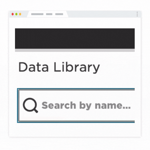
When we think about accessibility at mySidewalk, it starts with making data easy to find. Our team built a comprehensive data library of indicators of demographics, health, housing, safety, the economy and more. Each of those data sets gets validated, cleaned and improved by our data science team. For us, it’s not enough to simply aggregate data, it needs to be formatted for purpose, organized, and ready to use.
Make data easy to visualize and read.
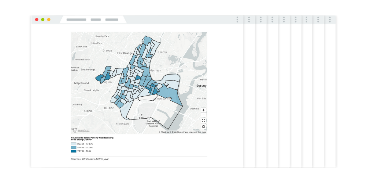
Data by itself isn’t particularly useful. When my son is selecting which wide-receiver to start this weekend, he isn’t looking at a spreadsheet, he’s looking at a well placed visualization. It’s hard to spot patterns and trends in data without bringing it to life. We see this as an accessibility opportunity on two fronts: making visualization and mapping tools accessible to non-data scientists, and then ensuring that what they create can be read by all. We designed our platform to make visualization and mapping as easy and simple as possible, and the resulting visualization will not only be beautiful and ready to read on a mobile device, but also legible by people with vision impairments (fully WCAG 2.0 compliant).

Tell a compelling story with data.
One question we often ask our new customers is to recall a time when they used data to make a decision. It's a simple question, but not always easy to answer. When we listen to the responses there is a clear pattern - the story surrounding the data is more important than any particular data point or visualization. This may sound intuitive, but it is the single greatest failing in the field of data science today. We are awash in unread data and research hidden behind boring spreadsheets, ugly visualizations, and pointless narrative. If you don’t have a compelling story to tell, don’t bother telling it.
To have impact, you need to succinctly communicate why the data matters. A good data story is one that’s read, understood, and engaging. That’s why features like ADA accessibility, interface design, mobile readiness, and data storytelling are core to our mission as a company. They exemplify our commitment to democratizing data and help to ensure that everyone has access to the knowledge and opportunity to live well and make their communities better.
Share this
9 Surprising Indicators of a Thriving Community

Data Storytelling Jobs Part 3: Build and Share Impactful Data Stories

No Comments Yet
Let us know what you think