
Working with data means working with place. Maps are a fundamental method to analyzing and sharing important information, but what's the right type of map to use? How do you go about doing it?
When we talk about democratizing data, access to best practice and intuitive tools are as important as access to the data itself. A complete understanding of when, why, and how to visualize data a particular way can help you better your connect with your audience.
To enable you with the skillset of communicating connections and relationships between data indicators, this quick best practice guide will help know when to use bivariate maps, how to make one right now, and a peek at how we're making them easier than ever.
What is a Bivariate Map?
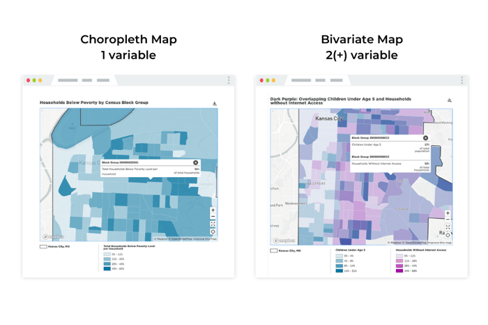
Most of the time, when you’re making a map you will be visualizing one variable (e.g. total population), for one area (e.g. a city or county), at one geographic level (e.g. census tracts). This is an efficient way to communicate to your audience how that single variable changes between political subdivisions of your area of interest. In cartography, these are known as choropleth maps.
Sometimes, however, the story we are trying to tell isn’t the measurement of a single variable: it’s about that variable’s relationship to something else.
In this case, a bivariate map may be useful.
A quick word of caution: in most cases, bivariate maps are not the best option for communicating a story in a map. In this post, we'll help you decide when it is appropriate to use a bivariate map, and then show you how to make one in mySidewalk.
When Should I Use a Bivariate Map?
Bivariate maps can be notoriously difficult to make, and it's important to know when the situation calls for one. You want to maintain accuracy and clarity in your data and how it's visually represented. In most cases, it's easier both for you and your audience to simply make two separate, single-variable choropleth maps. Representing multiple maps together, such as in a collection, can be a powerful and efficient way to show your audience how two (or more!) things are related.
Additionally, mySidewalk’s map filters can be a great way to draw your audience’s attention to the areas of your community that are influenced by two or more factors of your choosing.
However, if you think two variables (e.g. walkability and population density) are related geographically, and their relationship is what is important, rather than the individual measurement of either variable, then a bivariate map can be effective.
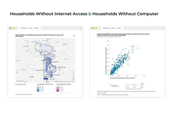 To check if the variables you are interested in are related geographically, use a correlation chart to see if the relationship between the two variables is significant. If there is a significant relationship between them, consider sharing the correlation chart alongside your bivariate map for complete data clarity. If not, it is probably best to go with two separate maps.
How to Create A Bivariate Map
If you think a bivariate map is best suited for your situation or you're ready to explore the tools available to you, the mySidewalk platform is ready with access to thousands of indicators in our data library. For more detailed instructions, you can visit our step-by-step guide to creating a bivariate map in mySidewalk here.
A Better Bivariate Experience
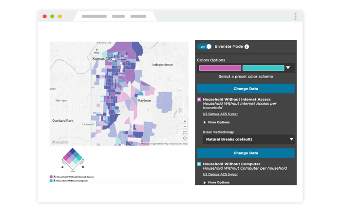
We take pride in making visualization tools as easy as possible, and we've been working on a new experience for bivariate maps 2.0 in mySidewalk. We're excited to be releasing these updates this month to enable more people with the ability to visualize and share important relationships in their data--and reduce the steps it takes to get there.
In fact, you'll now be able to toggle on Bivariate Mode with one click and immediately pick, normalize, and visualize your data.

The new Bivariate Mode will provide a better creation process for all users (our internal team is already loving it), as well as a more clarified legend style.
Now, when interpreting a bivariate map, the legend and visual design speaks to the same core principle that guides when to use a bivariate in the first place: the data relationship. Just as it's important to understand and communicate technically, the visual representation of your map goes a long way to connecting to your audience.
Get Started Today
We'll be sharing more information and notifications as our new bivariate map experience is complete, but you can get started working with bivariates and more right now by logging in and starting with a template. As always, our team is here to help.
Not a current customer?
We're happy to connect with you to learn more about you and your work and answer any questions you may have.

Share this

Data Storytelling Jobs Part 3: Build and Share Impactful Data Stories
Trusting Your Data: How to Build a System for Success

No Comments Yet
Let us know what you think