
Most people don’t know this, but I was on College Jeopardy. To this day, I can’t hear the name “Gerald Ford” without remembering the moment where I picked the wrong President as the answer to final Jeopardy during the semi-finals. I was one President off, and since I bet it all, the girl who guessed “Abe Lincoln” and bet nothing (!!!!) ended up winning by barely $1,000 bucks.
My Jeopardy experience shows that the right answer – in the form of a question – can have big consequences. While I walked away from Jeopardy with a lifetime supply of reference books and enough money for a European backpacking adventure, I still wonder what might have happened if I had picked the right question.
The questions we ask of our data are just as critical as Final Jeopardy. If we are serious about Health Equity, we will never get the answers we seek without the right questions. So, in honor of Gerald Ford, here are 5 questions you should ask of your data (and some examples of people doing it right!)
Question #1. Does this place matter?
One of the first questions you should ask about your health data is what do you want to see? Which indicators and places matter most? It’s also critical to ask yourself why you are approaching it the way that you are.
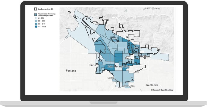
For example, let’s say you’re taking a look at households receiving nutrition assistance in your community. How do you map it? Census tracts, neighborhoods...political boundaries?
Ask yourself, is this MY preferred place to look at data? Or is this the place that most appeals to my audience? Consider your potential for bias and how others will interpret the story you’re creating.
Nutrition Assistance by Census Tract, San Bernardino, CA
Nutrition Assistance by City Council District, San Bernardino, CA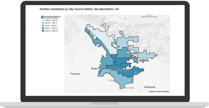
Census tracts may provide more granularity for researchers, but city council districts might capture the attention of council members faster. Let’s not forget actual residents, where neighborhood or zip code data speaks to their everyday language.
Ultimately, data is most effective when you view it through multiple angles and consider what will best connect your message to your audience with truth and clarity.
Question #2. Do these two things even correlate?
It’s all too easy to get stuck in a rut with your data analysis, and forget to question your assumptions at every step. We often lean on our existing experience without even thinking about it. We’re deep in the weeds and that gut feeling takes over: This makes sense, it must be true. I have to share this. But a status quo mindset is a problem. A mission-critical problem, in fact.
Be mindful to catch yourself assuming correlation – theoretically, based on your viewpoint. Ask yourself: Can I back this up? Am I missing something? Are these indicators actually related?
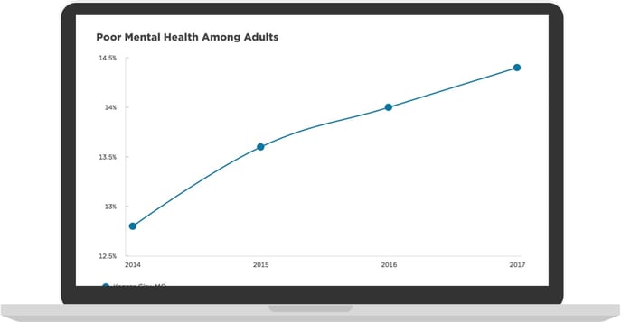
Dive into these questions to conduct and share your analysis with objectivity. For example, Kansas City, MO correlates mental health with social and economic forces.
They provide a clear data visualization, a confidence interval to describe the relationship, and context to the bigger picture. Finding the right correlations sets you on a path to powerful data and being able to answer your most critical questions.
Question #3. Who are my peers?
Everyone loves being a “winner.” But if you’re honest, you know this satisfaction can quickly become complacency. When you come out on top compared to other communities in your state, it could lead you to lose a sense of urgency.
Consider adopting a new peer communities approach. When making comparisons, we recommend not limiting to nearby cities and counties of similar size and circumstances, but also aspirational communities. Those that are bigger or have more resources than you. That way, even if you’re beating your peers on key indicators, you’ll still stay inspired to improve and grow.
Need somewhere to start? Shoot us a message mentioning this article we can whip up a free Social Determinants of Health Report that covers your community and compares against your peers. You might also enjoy seeing how your state’s data portal stacks up.
Question #4. Do I have some habits to unlearn?
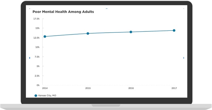
This can be the hardest question to ask yourself. It’s hard to change our ways, especially when we have legitimate reasons for them. For example, it’s Epi 101 to have graphs start with a zero axis.
But when we have small changes in meaningful indicators, this devotion to the textbooks can ignore human lives. A 1% point change in a condition or disease can be hundreds or thousands of people, depending on your population. Their stories matter too.
What’s a public health servant to do? Have your cake and eat it too – calculate both ways.
Caption: A 1% point change in KC can account for 3000+ individuals with poor mental health
Questioning your habits can create more work, and may be uncomfortable – but remember why you’re doing it. In the long run, you’ll make sure all your habits make a positive impact.
Question #5. Will anyone understand this?
Your message is only as effective as your audience says it is, which is why your goal as a communicator should be to make your message easy to understand. There’s a great design principle to live by that states “don’t make them think.” In other words, your audience is busy, and often tired and stressed. So make their lives as easy as possible.
There’s a fair bit of research about how reading comprehension drops once you write higher than a standard 8th-grade reading level. It’s one reason why the official website of Massachusetts is committed to writing at a 6th-grade reading level.
Another great example? mySidewalk customer Clay County, FL. They taught us a thing or two and led the language of their upcoming CHIP to be as inclusive and accessible as possible with an 8th-grade reading level.
In our own backyard of Kansas, Johnson County Health integrated their own imagery and infographics in their CHA to visually supplement their data story. Both are great examples of how departments can leverage modern, best-practice templates while using their own voice.
Practical Messaging Tips
- Make it “skimmable”
- Use headlines, bullets, and summaries whenever possible
- Use free tools to check clarity and reading level
The bottom line is, the easier you design your message for your stakeholders, the more likely it will be read and understood. When you pick the right questions you’re in a much better position to find the answers for Health Equity (and not be haunted by Gerald Ford, like me).
Answering these five community health questions will ensure you’re not just collecting data, but that you’re making your data work for you.
If you’re not sure which public health indicators you should measure, or you’re just ready to take your public health data to the next level, we can help. Learn more about mySidewalk Public Health Solutions.
Written by: Dr. Sarah Martin, mySidewalk Public Solutions Director. Read her blog on Medium, or follow her on Twitter.
Share this

3 Ingredients You Need in a Successful Community Health Assessment

Vitalyst Spark: The Health Data Challenge, Part 1

No Comments Yet
Let us know what you think